The campaign page and video: what the first ten seconds have to do
When a stranger lands on your campaign, you have seconds to make them get it. Here is the page structure, the headline test, the proof to stack, and the video formula that does the convincing.
When someone lands on your campaign, you have seconds to make them get it. Your job is to present the product so simply that a stranger understands why they need it before they finish the first screen. That means copy that follows the three Cs: clear, concise, compelling. Don't be clever or coy, and don't leave bits out to "build intrigue." Get to the point fast, then make them feel it.
This article covers the page from the top down: the headline, the structure that works, the proof to stack, the FAQ as an objection tool, and then the video, which is the single most important asset on the page. It is drawn from the chapter on campaign pages in The Crowdfunding Quick-Guide, with the production detail from the video and photography chapters folded in.
The headline is the most important line on the page
Not the subhead. Not the intro paragraph. The headline. A great campaign headline does one of two things: it names a problem your backer already knows they have, or it promises an outcome they already want. "The insulated bottle that actually fits in your car cupholder" is a headline. "Premium hydration, engineered for life on the move" is not. The first speaks to a frustration. The second could describe anything.
Test yours by reading it aloud to someone who knows nothing about the product. If they immediately understand what problem it solves, it works. If they tilt their head, rewrite it. This is the same test as the USP test, and that is not a coincidence. The headline is your USP with the product name attached.
{{ attentionSvg }}What the page has to do, in order
After the headline, your job is to hold attention long enough to reach the ask. Lead with what the product does for them, not what it is or what it is made of. Then show the problem. Make people feel the frustration for a moment before you rescue them with the solution. Then demonstrate it; this is where GIFs and photos do the heavy lifting, not copy. And then, critically, address doubt. A backer who is 90% convinced but slightly unsure will close the tab and forget you. The comparison table, the FAQ, the testimonials, the team section all exist to remove that last bit of resistance. Don't save them for the bottom. Scatter reassurance throughout.
The outline I keep coming back to has six beats. Introduce the product, what it is, in one line. Show the main benefits, what changes for them. Hit the pain points and who benefits most. Show how it works, ideally with a GIF. Break down rewards, add-ons and stretch goals. Introduce the team and make it human.
{{ outlineSvg }}Use GIFs to break up the copy. On Kickstarter and Indiegogo they autoplay, and people are wired to stop scrolling when something moves. And if you are new against fast-shipping Amazon rivals, a comparison table and a few testimonials do a lot of quiet convincing.
Don't be afraid of a long page
Crowdfunding pages are routinely the longest product pages on the internet, and that is fine, because visitors are in research mode. They want everything. Give them everything. But structure it so someone who reads only the first third has enough to back, and someone who reads to the bottom still finds something new. Short paragraphs, aggressive subheadings, a visual break every few hundred words. The page should feel like it is moving forward, not like a wall of text that never ends.
Social proof: stack it everywhere
New visitors are constantly scanning for signals that other people have already decided this is worth backing. Give them those signals prominently and often. Press logos, even from smaller publications, carry real weight. A quote from a real tester in a pull-out callout is more persuasive than three paragraphs of your own copy. Backer comments from your community, with permission, are gold. And the funded amount and backer count at the top of every campaign page are the ultimate social proof, which is yet another reason funding fast matters. The numbers work for you or against you every hour the page is live.
Testimonials work when they are specific. "Amazing product!" does nothing. "I tested this for two weeks and it's the only bottle I've used since. The lid design finally solved the leak problem I've had with every other brand" does a lot. Reach out to your testers before launch and ask for an honest quote about the problem it solved and how. A handful of those, placed near the price anchoring, near the FAQ and near the bottom call to action, closes the gap between "interesting" and "I'm buying this."
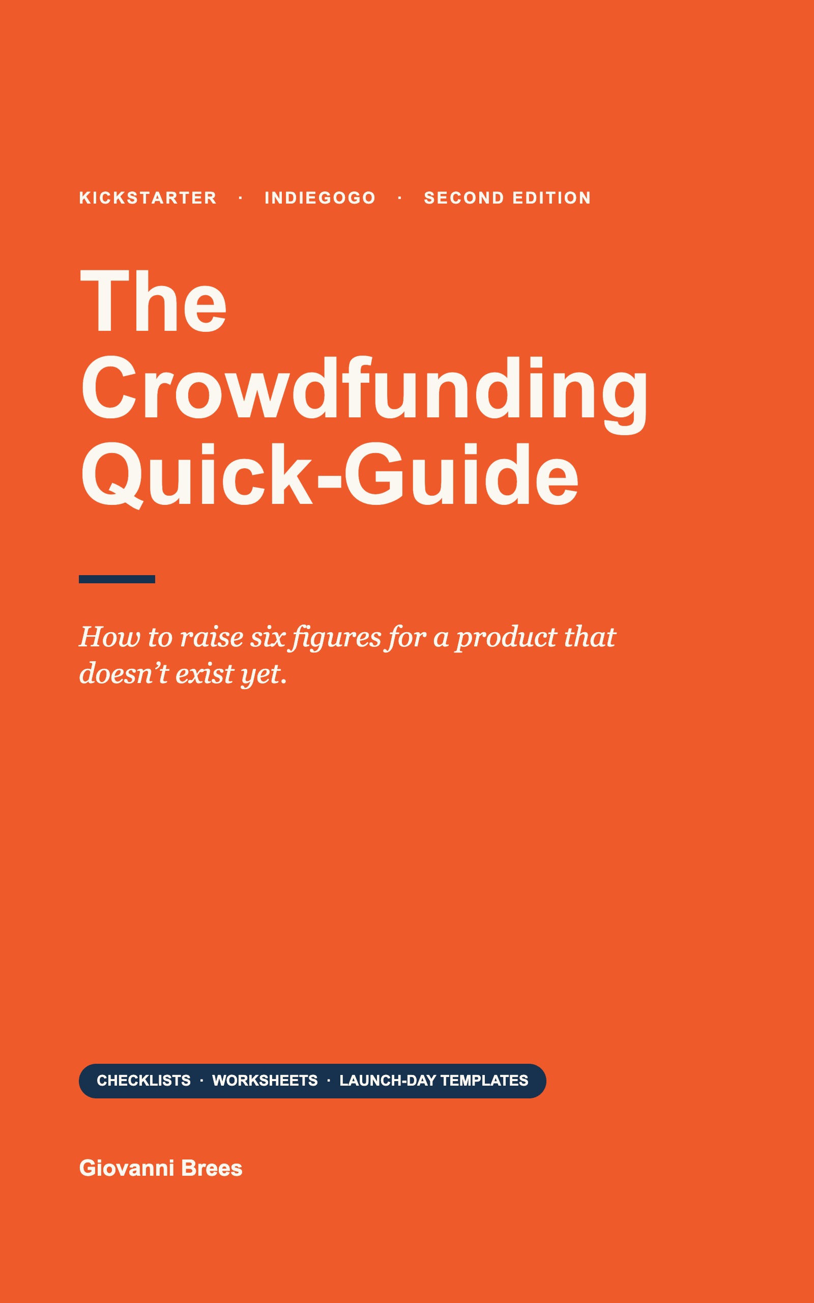
Plus Chapter 22, the campaign video shot by shot, and Chapter 21 on product photography.
Get the book on Amazon →The FAQ is your best objection-handling tool
Every backer who is almost convinced has a question. Most won't ask it. They will just not back you. Your FAQ catches those people and answers the doubt before they leave. Write it by listing every question you have been asked about the product, every concern a skeptic might raise, and every practical detail a serious buyer wants. When does it ship? Can I change my address later? What is the refund policy? Does it come in other sizes or colors? Will it work on my country's voltage? Is there a warranty?
Answer each one directly and honestly. Don't be evasive about delays or uncertainty. If the delivery timeline is "Q3 and potentially later," say that. Backers who back anyway are your most committed supporters. Backers who feel misled by vague optimism become your most vocal critics. A well-written FAQ with fifteen honest answers to real questions converts a meaningful share of the "almost but not quite" visitors who read it.
Write the Risks and Challenges section like you mean it
Both platforms require it. Don't treat it as a legal formality. Name the real risks: manufacturing delays, a component never produced at scale, international shipping complexity, a first-time team. Explain how you are mitigating each one. Backers read this section carefully. A creator who acknowledges real risks and explains the plan comes across as credible. A creator who writes "we don't anticipate any risks" comes across as naive or dishonest. The backers who fund risky campaigns are the ones who trust the creator's judgment, and that trust is built partly by showing good judgment about your own risks.
The video is your single most important asset
A great campaign is 70 to 80% visual, and the hero video is the centerpiece. Keep it under two minutes. Hook them in the first five seconds. Show the product solving a real problem. Let the founder appear so there is a face to trust. End with one clear call to action. Structure it with the formula I come back to again and again: Attention, Agitation, Activity, Action.
{{ aaaaSvg }}Attention grabs them in the first line. Agitation presses on the pain you solve. Activity shows, on screen, how you solve it. Action tells them exactly how to get it. Block out a 90-second script with one line per beat, plus a founder moment between the demo and the call to action. If you can't fill a beat, that is the weak spot to fix before you shoot anything.
Shooting it: the production habits that matter
You don't need a $20,000 production. I have seen phone-shot videos outperform slick agency work because the founder was natural on camera and the demo was compelling. That said, a few basic disciplines separate "watchable" from "professional," and none of them need expensive equipment.
Get the lighting right first. Lighting is the single thing that most separates a phone video from a polished one. Natural light is free: shoot early morning or late afternoon to avoid harsh overhead shadows. Indoors, open every curtain, add a cheap ring light or softbox, and put the light in front of the subject, not behind.
Audio matters more than you think. People tolerate a slightly shaky image. They click away from echoey or muffled sound in seconds. Don't use the built-in mic for anything with voice. A $30 to $60 lavalier mic that clips to clothing is the best money you will spend. For a demo with no voiceover, music in post solves it.
Shoot more than you need. B-roll, the supplementary footage of the product, hands using it, the environment it lives in, is what gives a video texture and pace. For every 30 seconds of finished video, plan five to ten minutes of material. Skimping on the shoot day is almost always a mistake.
Keep the camera steady. Unnecessary zooming and panning feels amateur. Use a tripod or a phone gimbal. Even resting the phone on a flat surface beats freehand.
Clean the frame. A coffee cup in the corner, a cable crossing the table, a cluttered shelf: small details pull attention from the product. Spend five minutes tidying everything the camera can see.
Edit for pace, not length. If a cut can go without losing meaning, make the cut. A tight 60-second video that covers everything will outperform a loose three-minute one every time. When you think you are done, watch it back and ask whether every shot moves the story forward. Cut anything that doesn't.
Photography: the stills do more work than you think
The video gets the attention, but the stills get read. Most visitors scroll the page with the video paused, and every image is a chance to answer a question without copy. You need five kinds of shots. A clean hero on a plain background that shows the whole product in one glance. Detail shots of the parts that justify the price. In-use shots with real hands and a real environment, because that is where the backer imagines themselves. A scale shot next to something familiar. And a "what's in the box" layout for the main tier, so nobody has to guess what they are getting.
Shoot them in the same session as the video, with the same lighting and the same clean frame. Consistency across the page reads as professionalism, and professionalism reads as "this team will actually ship."
Five page mistakes that cost backers
Opening with the origin story. "It all started in 2019 when I was hiking in Patagonia" is a fine third section. As the first thing a visitor reads, it delays the only question they came with: what is this and why do I want it. Earn the story by answering that first.
Specs before benefits. A table of dimensions, materials and battery capacity near the top of the page is a spec sheet. It belongs lower down, after the visitor already wants the product and is checking whether it fits their life.
Burying the price. Visitors will scroll to find the price before they read anything else, and if they cannot find it they assume it is high. Put the reward ladder and the retail anchor in the first half of the page, and repeat the best tier near the bottom call to action.
Stock photography and renders only. A page with no real photo of a real unit in a real hand tells experienced backers that the product may not exist yet. Even one honest prototype photo, clearly labeled, builds more trust than ten perfect renders.
One call to action at the very end. Backers decide at different points. Someone convinced by the demo GIF should not have to scroll through the team section and the FAQ to find the button. Place a call to action after the demo, after the reward ladder, and at the end.
The pre-publish test
Before you submit the page for platform review, do one thing. Send the preview link to three people who match your buyer persona and have never seen the product. Ask them two questions: what is this, and why would I buy it. If their answers match your headline and your first benefit, the page works. If they describe a different product, or a different reason, the page is not ready. The fix is almost never more content. It is a clearer headline, an earlier demo, or a proof point moved up the page.
Questions people ask
How long should a Kickstarter campaign video be?
Under two minutes, and 60 to 90 seconds is often better. Hook the viewer in the first five seconds, show the product solving a real problem, let the founder appear briefly, and end with one clear call to action. Edit for pace, not length.
What should a crowdfunding campaign page include, in order?
One line that says what the product is. The main benefits. The pain points and who benefits most. How it works, ideally as a GIF. Rewards, add-ons and stretch goals. The team. Then social proof, a comparison table, the FAQ and an honest Risks and Challenges section.
How do I write a campaign headline that converts?
Name a problem the backer already knows they have, or promise an outcome they already want. "The insulated bottle that actually fits your car cupholder" works. "Premium hydration engineered for life on the move" could describe anything. Read it to someone who knows nothing about the product; if they tilt their head, rewrite.
What is the A.A.A.A. formula for a campaign video?
Attention, Agitation, Activity, Action. Grab them in the first line, press on the pain you solve, show on screen how you solve it, then tell them exactly how to get it. It works for a 60-second hero video and a 15-second ad alike.
Do I need an expensive production for the video?
No. Phone-shot videos regularly outperform agency productions when the founder is natural and the demo is strong. Spend on a $30 to $60 lavalier mic and good lighting, use a tripod, clean the frame, and shoot five to ten minutes of footage for every 30 seconds you will use.
Should the campaign page be long or short?
Long is fine. Crowdfunding pages are the longest product pages on the internet because visitors are in research mode. Structure it so someone who reads the first third has enough to back, with short paragraphs, strong subheadings and a visual break every few hundred words.
The page is where the campaign is won or lost. The book shows you how to build every part of it.
USP, pre-launch funnel, platform, pricing, the page, launch day, press and fulfillment. With worksheets to do it as you read.
Buy on Amazon →

Founder of BoostYourCampaign, one of the top three crowdfunding marketing agencies in the world, and author of The Crowdfunding Quick-Guide. His teams helped creators raise more than $600 million on Kickstarter and Indiegogo.